
The thought of fresh flowers adorning our gardens, the sounds of baby birds chirping from above and the sight of sunlight shining down on the green panorama is something to look forward to.
Incorporating the dreamy hues and cooler tones of the budding season into our homes is a great way to revive our spaces.
Read on to get the inside scoop on the shades that will make you and your home feel springtime ready.
Taupe
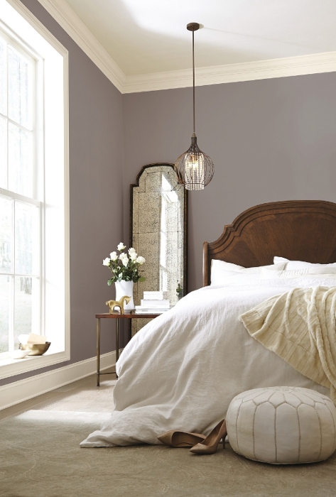
Image via Setting for Four
The warming and soothing feelings associated with the color taupe make it a great option to incorporate in your bedroom and/or living room walls. Pair it with wood and creamy white furniture to take the relaxing look to the next level.
Sunshine Yellow
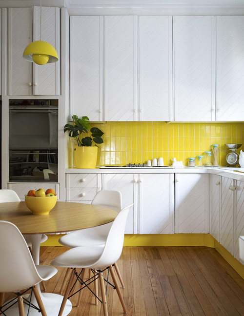
Image via Design Sponge
What better way to welcome in the lights of the season than by instilling the color of the sun into your living spaces? This bright color is best suited for kitchens but can also be used in your furniture pieces to make grand statements.
Pale Peach
Image via Loving It
This sweet and simple color is great for those who wish to liven up their spaces without making a drastic change. By adding in peach tones to your home’s décor or room walls, you’ll instantly warm up your home with the incorporation of this sweet hue.
Pale Green
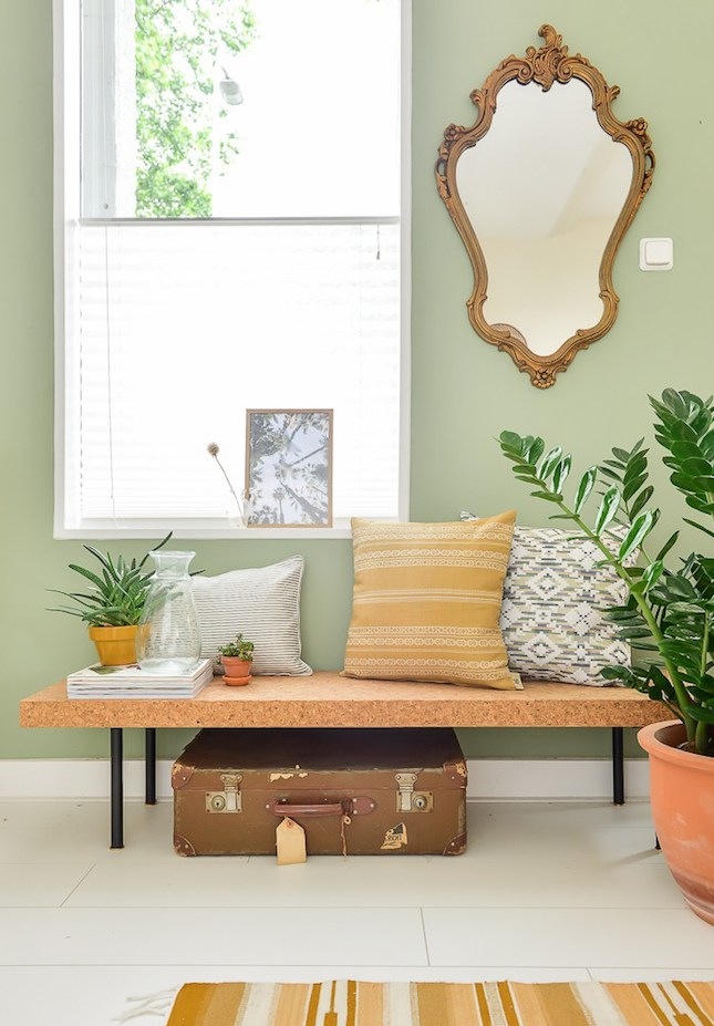
Image via Binti Home
Being that Greenery is Pantone’s Color of the Year for 2017, it comes as no surprise that this revitalizing shade is on track for being one of the trendiest colors this spring. The shade looks great against natural combinations like wood furniture and also subtler counterparts like soft, gray finishes.
Magenta
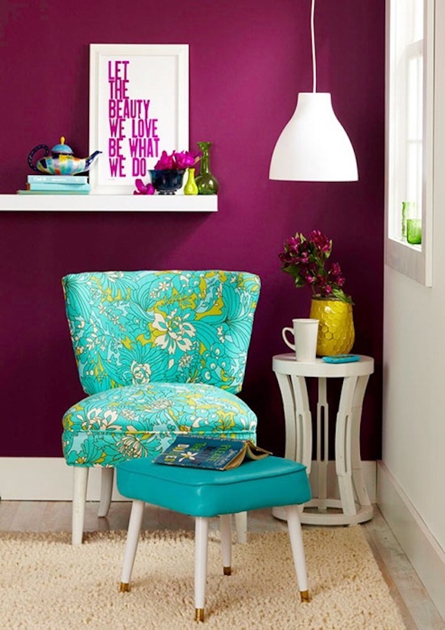
Image via Better Homes & Gardens
If you’re looking for a color to take center stage, then consider incorporating the vibrant hue of magenta into your home. The attention grabbing nature of the color allows it to shine with minimal application. That being said, it’s important to remember that a splash of the color goes a long way.
Light Aqua
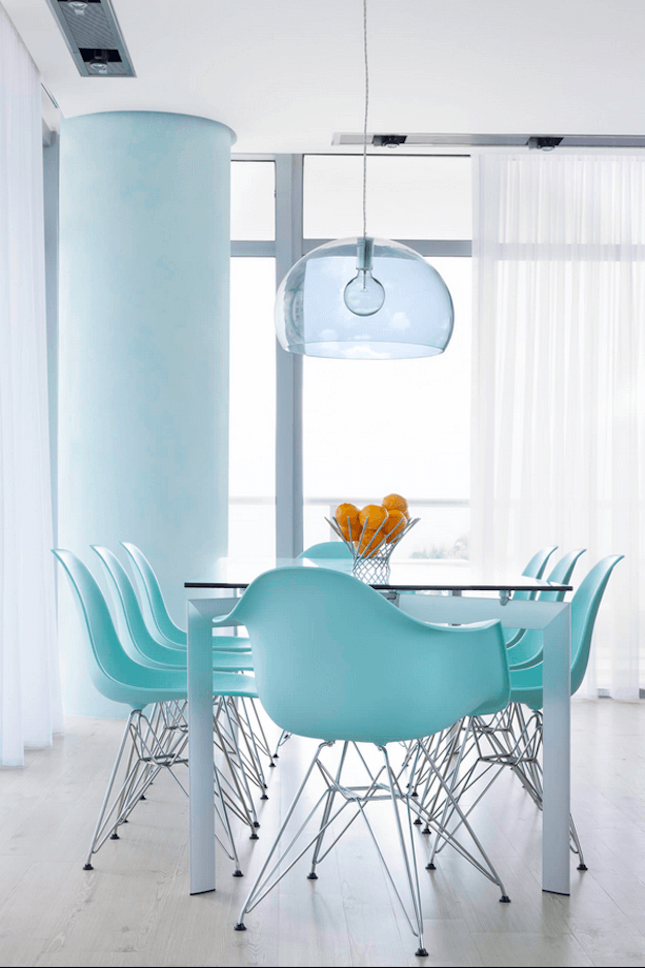
Image via Big Time Design
Feel the sea’s breeze brush against your living spaces with this refreshing shade. This beautiful blue looks stunning in all kinds of materials including tile and wood and in all kinds of furniture pieces like couches and dining sets.
Gray
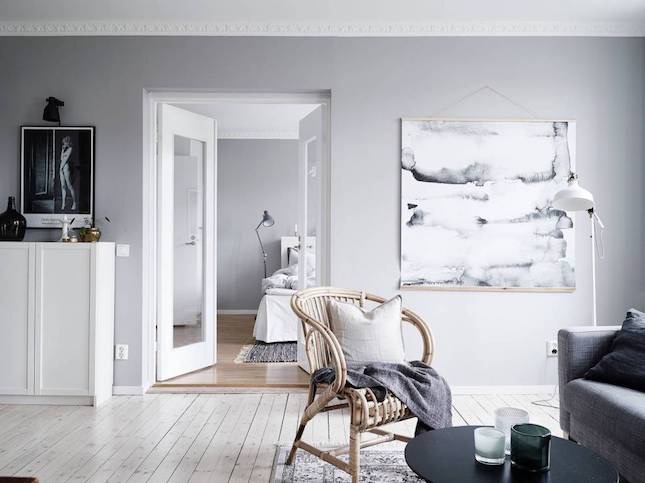
Image via Make a Home
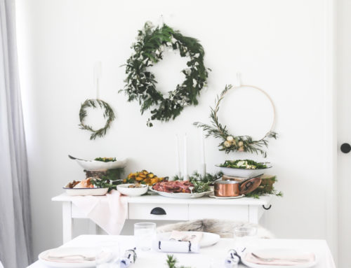
Think all gray everything when playing with this versatile color. By layering up different shades of the sophisticated color into your space, you’ll make a major design impact. That’s not to say that it can’t be paired with complimenting colors like blushes and coppers for a chic and delicious look.
Dusty Rose
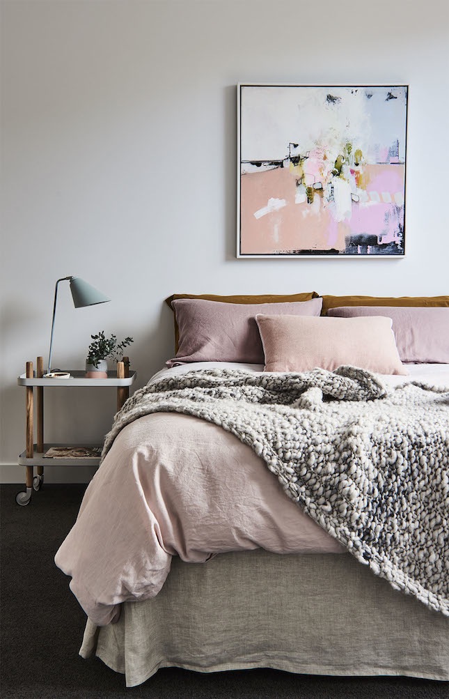
Image via Rebecca Judd Loves
While the sweet shade may have been Pantone’s color pick for 2016, that doesn’t mean the color isn’t worthy of making our list this year. This romantic hue is perfect for incorporating into your bedroom and living room furniture.
Dusky Blue
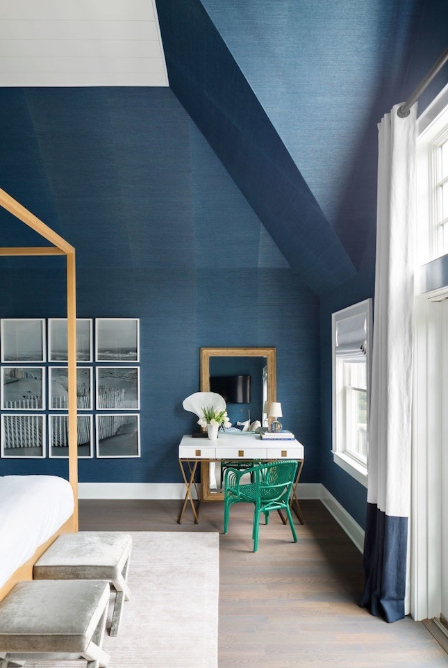
Image via Elle Decor
For a cool aura, considering adding some deep blue into the mix. The sophisticated yet playful shade has a tendency to de-stress after a long day thanks to its relaxing look. Try pairing it with coral, white, gray or dusty rose décor.
What other color are you looking forward to incorporating into your home this spring?


Leave A Comment